Designbase
A design system for Homebase
Skills
UX design, UI design, strategy and planning
Tooling
Figma, Storybook, Supernova, Slack, Google Forms (for surveys)
Deliverables
Component library, documentation, and planning (sprints, multi-year)
Tech
React Native for responsive web, Android (phone), iOS (phone & tablet)
Team
1 design lead/PM (me), 1 content strategist, 1 junior PM, 1 part time designer and 4 devs supporting a design team of 13 and 30+ devs

Statistics
Based on the first 12 months of implementation
825% increase in inserts
From 4,000 inserts to 37,000, year over year
17% increase in NPS
NPS score increased from 34 to 40
100% adoption
Across 6 teams with 13 designers
How this was accomplished:
Support: I offered 1x1 support through Slack, Zoom and Loom, as well as feedback during weekly critique.
Usability: created bug-free, responsive components with built-in accessibility.
On-brand: aligned closely with brand to ensure every component embodied brand guidelines.

Context
2022: Designbase was born
A new design system: Internet startup Homebase hires a contract company to build their design system.
A tough first year: analytics showed slow adoption and high-usage of other systems. The result was a disparate user experience and a stagnant NPS score.
Time for change: Leadership decided to radically change course.
2023: A new approach
Purpose: I joined the company and took on the task of increasing adoption.
Components: Created 32 components and patterns in the first year
Design Ops is born: Hired 1 person as a junior collaborator and project manager
2024: Design ops level-up
Onboarding and Continued education: an initiative to ensure new and existing team members have the tools to fully utilize the system.
Rebrand: the design system will translate a new brand into the products
Storefront: migrate documentation out of Figma and into Supernova
Rapid growth: support rapid growth of the engineering and design org
Components
-
![Empty state example show stacked image, title, description and a centered button.]()
Empty State
-
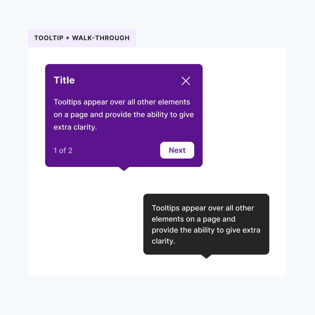
![Examples of tooltips and walk throughs. The tooltip is black and very simple. The Walk-through tooltip is dark purple and contains a title, description, count and buttons.]()
Tooltip & Walk-through
-
![Pills are displayed in a grid showing various colors for corresponding states. Example: warning is orange and has a triangle icon. Error is red and has a stop sign icon.]()
Pill
-
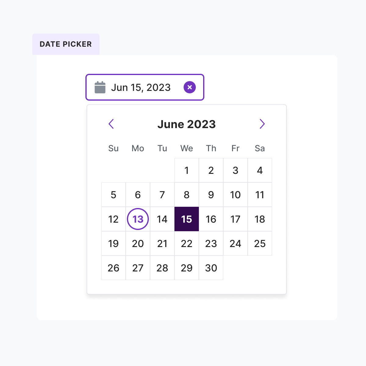
![Date picker example show a text input with a date inside and a dropdown with calendar picker. The date is June 15, 2023.]()
Date Picker
-
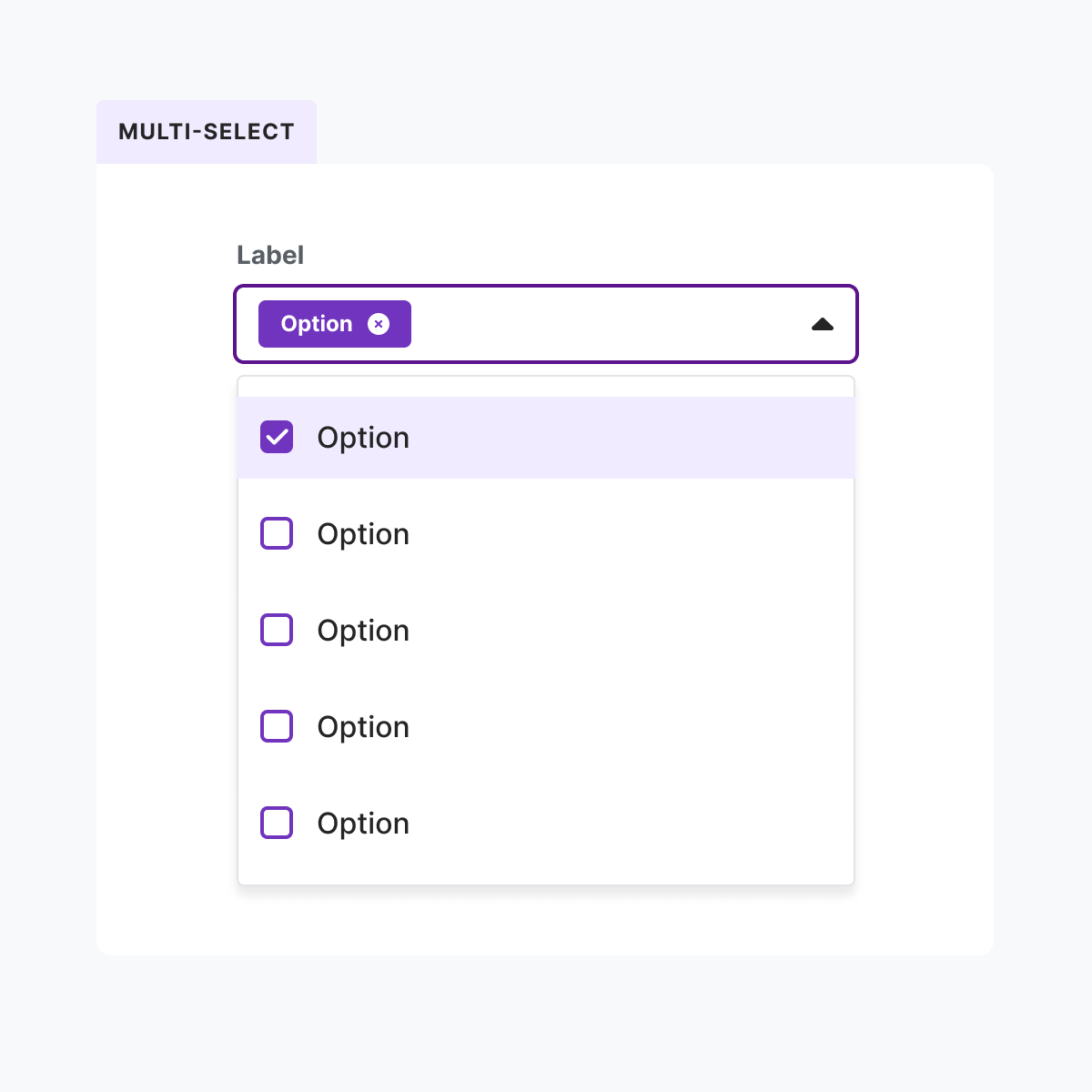
![A multi-select dropdown with dismissible pill inside the text input. The dropdown contains a checkbox list of 5 options, with the first one is selected.]()
Multi-select


Documentation


Strategy
-

Planning
Coordinate across LOBs and disciplines. Share out plans and processes with ICs and leadership. Organize efforts from sprints to multi-year.
-

Process
From contribution and Governance models to full product process diagrams, these efforts level-set expectations, foster self-service, and aid onboarding.
Rebrand 2024
The design system was tasked with interpreting and managing the rebrand within the product suite, including brand defined colors, typography and a new vibe. This involved:
Create mock-ups to guide product designers as they implement the rebrand in their product areas
Use these same mock-ups to define guidelines for color, component adjustments, and new design tokens
Collaborate with native app and desktop engineering teams as well as product management to ensure consistent and efficient implementation in the software
Align with brand leadership and the execs every step of the way


